 HOMES COLORADO | SPRING 2003
Height of Style
Rustic materials polished to a fine finish blend Colorado tradition with city sophistication in this Telluride treasure.
Reported by Stephen Titus.
Photographed by David 0. Marlow.
Unless you ‘re doing a Frank Lloyd Wright house and you need all arts and crafts, you really need a mix of furnishings so the home doesn’t seem dated.
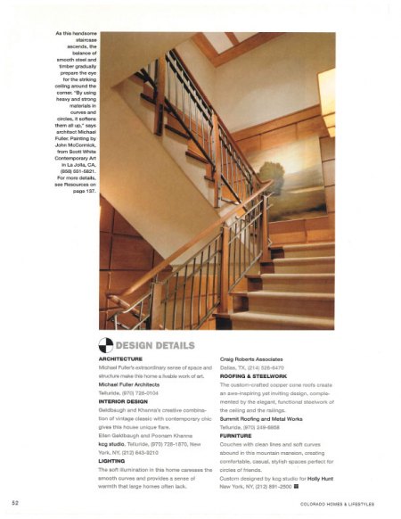
A certain image comes to mind when you mention Colorado architecture and interior design: logs, antler chandeliers and an elk carved into the front door. It’s a time-honored style that is at home in the region, but a trend is taking hold that calls for polishing the rustic materials to create a contemporary look that is loyal to the mountain aesthetic without the rough edges. Interior designers Ellen Geldbaugh and partner Poonam Khanna of keg studio are at the forefront of this trend. The duo collaborated with architect Michael Fuller, AIA, to design a home in Telluride that incorporated natural tones and classic mountain materials, but achieved a streamlined look that will be in vogue 20 years from now.
“We were respectful of the mountain setting but we wanted to bring in a fresh perspective and a modern aesthetic, which is more what Ellen and I are about,” Khanna says. Khanna and Geldbaugh hold master’s degrees in architecture, and maintain offices in Telluride and New York City. They say the combination of big city and big mountains helps them keep in touch with the cutting edge in fashion and design while understanding the needs of mountain-resort homeowners- in this case, a young couple with four children and a fifth on the way who use the home for holiday gatherings and regular getaways.
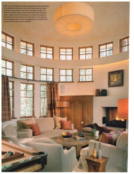
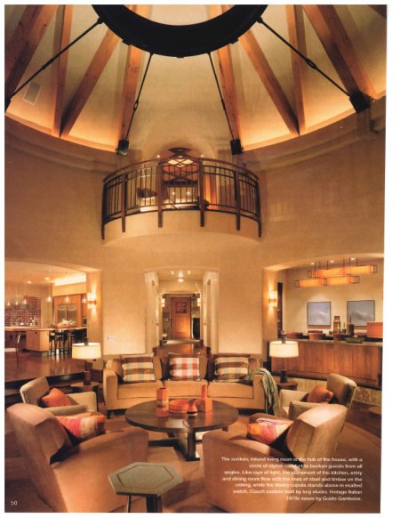
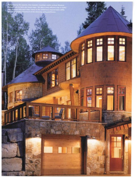
They are an active, outdoorsy family,” Geldbaugh says. “They’re in Telluride not because of this house but because of what’s outside the house.” A striking aspect of the home, both inside and out, is its size. With five bedrooms, an office, a family gathering area, adults’ living room, a formal dining room and a kitchen large enough for catering, it is a big place. But walking through the rooms, one gets a sense of intimacy and warmth that comes from a smaller house. From the outside, careful use of landscaping and placement of the structure on the lot blends the home into its surroundings and makes it seem more compact. “You can’t actually see the whole house at once, you have to look around corners,” Fuller says. “From the front, you wouldn’t know that there is a whole other story around back.” Khanna notes that the scale of furnishings was another element that gave the house more human proportions. One example is in the great room, where the designers placed massive, 19th-century Chinese urns alongside a pair of polished World War II binoculars mounted on a wooden tripod.
“We searched high and low for really unusual pieces that are timeless,” Geldbaugh says. “Unless you’re doing a Frank Lloyd Wright house and you need all arts and crafts, you really need a mix of furnishings so the home doesn’t seem dated.”
This careful mixing is carried off in every room, with many of the furniture pieces and fixtures coming from the 1950s and ’60s, and the rest custom designed to blend with the lines and quality of the mid-century pieces.
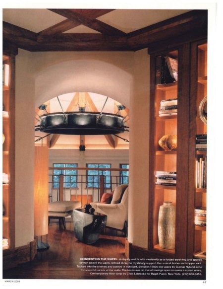
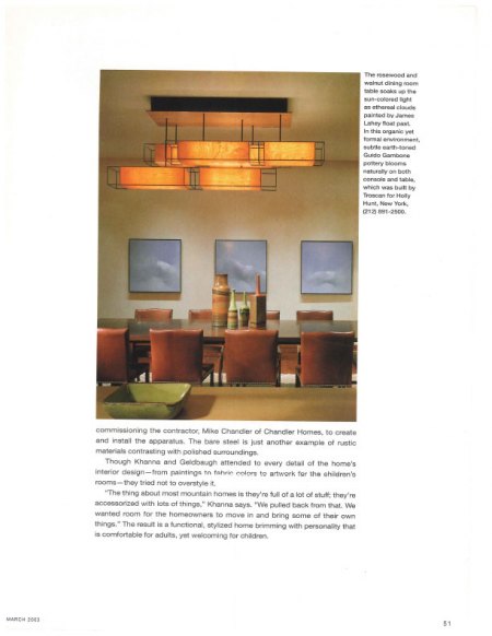
“We like things that have clean lines and architectural representation,” Khanna explains. “It’s because of the quality of what was produced then [that we chose them]. It’s hard to find that quality now. It’s also the lines. They provided very generous proportions and lines without being too puffy.” Then, of course, there are the custom pieces that tie everything together to create a look designers call a streamlined mountain aesthetic. Some perfect examples of this are the living room sconces, dining room pendant and other lighting created by New York lighting designer Robert Lewis in collaboration with Khanna and Geldbaugh. Made of ultra-thin wood veneer stretched over a metal frame, the fixtures seem solid and heavy, but the delicate grain accentuates an organic charm. The wood grain blends beautifully with the natural tones of the walls and floors, and the light passing through the veneer brings out the individual character of each piece. Another unusual touch that marries the rustic with the refined is a chunk of coal, mined in Pennsylvania and polished by New York furniture designer Jim Zivic into a high-gloss side table that sits alongside a ’50s-era chair and a limited edition Chris Lehrecke floor lamp. This arrangement is in the library’s balcony, which juts into the cupola (cylindrical extension to the roofline) above the main living room. The setting, says Fuller, is one of his favorite parts of the house. “Being up in the structure like that, you really have a sense of the light in the cupola,” he explains. “I like experiencing spaces at different levels.”
It also provides a close-up view of the ceiling tension ring and spoke system that offers both structural support and sculptural appeal. Fuller built several models of the ring before commissioning the contractor, Mike Chandler of Chandler Homes, to create and install the apparatus. The bare steel is just another example of rustic materials contrasting with polished surroundings.
Though Khanna and Geldbaugh attended to every detail of the home’s interior design-from paintings to fabric colors to artwork for the children’s rooms-they tried not to overstyle it.
“The thing about most mountain homes is they’re full of a lot of stuff; they’re accessorized with lots of things,” Khanna says. “We pulled back from that. We wanted room for the homeowners to move in and bring some of their own things.” The result is a functional, stylized home brimming with personality that is comfortable for adults, yet welcoming for children.

